Shadcn: Customizable and Open Source UI
Explore how to elevate your web projects with Shadcn's flexible, open-source components and install it in your React projects.
What is shadcn? 🤔
Shadcn stands out among the many UI frameworks and libraries as a helpful resource for developers looking for an open-source, customizable way to create stunning and useful user interfaces. Shadcn is a tool to help you build your component library. These are components that you can copy and paste into your apps.
It's not a component library, which means you do not install it as a dependency from a package manager such as npm. Shadcn provides beautiful UI components which can be directly added into your app as code and you can customize it all you want.
How to install shadcn in a React project?
Start by creating a new React project using vite:
npm create vite@latest shadcn-app -- --template react-ts
or if you're using yarn:
yarn create vite shadcn-app --template react-ts
Now enter into the app by running:
cd shadcn-app
Install all the dependencies by running:
npm install
or if you're using yarn:
yarn
Install tailwindcss and it's dependencies, then generate your tailwind.config.js and postcss.config.js files:
npm install -D tailwindcss postcss autoprefixer

npx tailwindcss init -p
or if you're using yarn:
yarn add -D tailwindcss postcss autoprefixer

npx tailwindcss init -p
Edit the tsconfig.json file
{
  "compilerOptions": {
    // ...
    "baseUrl": ".",
    "paths": {
      "@/*": [
        "./src/*"
      ]
    }
    // ...
  }
}
Now run the following so you can import "path" without error:
npm i -D @types/node
Add the following to vite.config.ts so your app can resolve paths without error:
import path from "path"
import react from "@vitejs/plugin-react"
import { defineConfig } from "vite"

export default defineConfig({
  plugins: [react()],
  resolve: {
    alias: {
      "@": path.resolve(__dirname, "./src"),
    },
  },
})
Now run the shadcn-ui init command to setup the project:
npx shadcn-ui@latest init
or if you're using yarn:
npx shadcn-ui@latest init
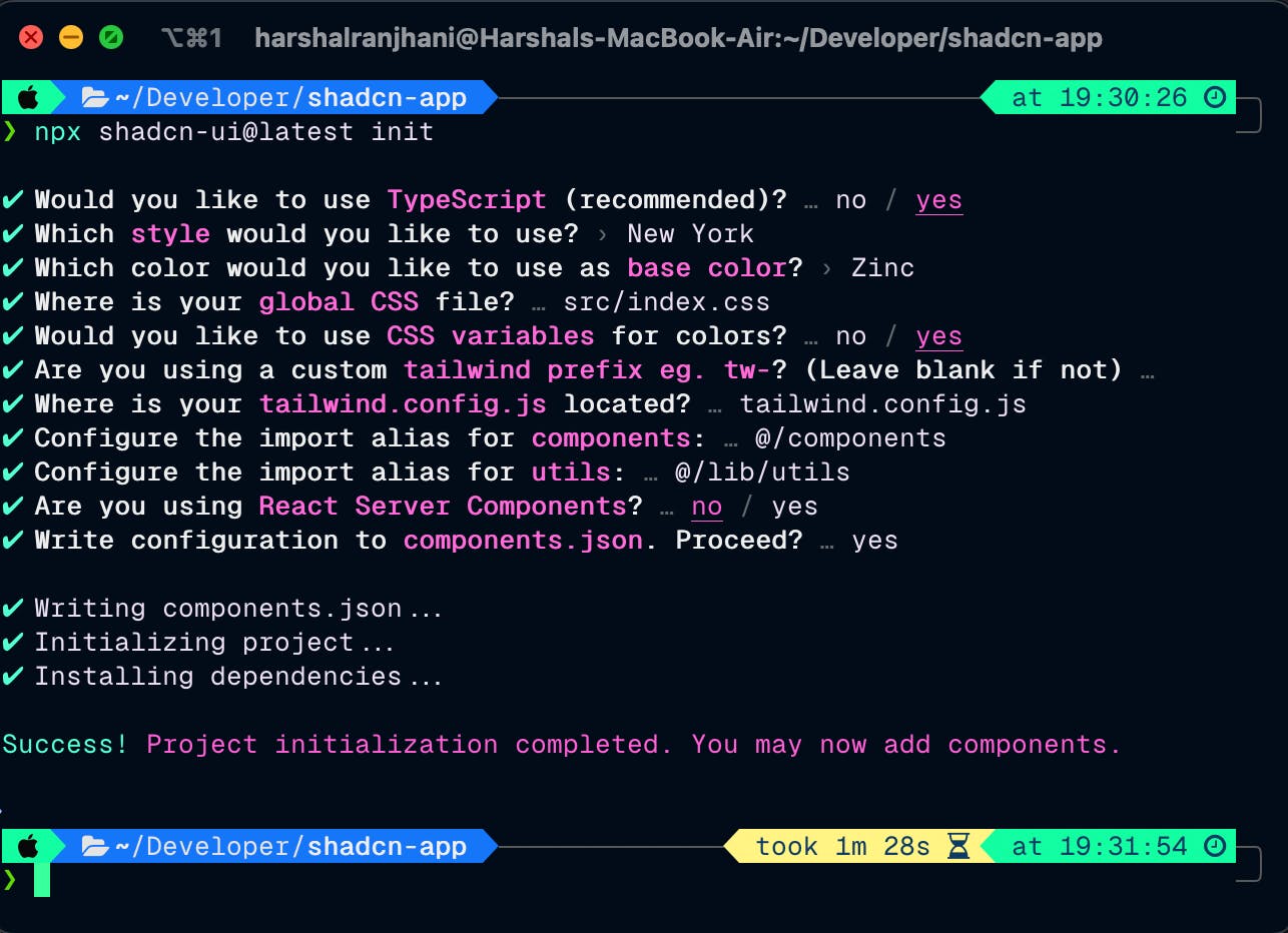
After running this you'll be prompted with a few questions, you can answer them according to your preferences or follow along with me as shown:

That's it! Now we're set to add shadcn components to our app in a breeze! 🎉
There is a massive list of components we can add that shadcn provides us, you can find the list here. Starting from Accordion all the way to tooltips we have almost all components used in projects with a great design.
In this article, I am going to show you how to add a button as well as an alert dialog component using shadcn. You can try adding other components as well!
To add a button component let's run:
npx shadcn-ui@latest add button
or if you're using yarn:
npx shadcn-ui@latest add button
To add the alert dialog component run:
npx shadcn-ui@latest add alert-dialog
of if you're using yarn:
npx shadcn-ui@latest add alert-dialog
Change the App.tsx to this:
import { useState } from "react";
import "./App.css";
import { Button } from "@/components/ui/button";
import {
  AlertDialog,
  AlertDialogAction,
  AlertDialogCancel,
  AlertDialogContent,
  AlertDialogDescription,
  AlertDialogFooter,
  AlertDialogHeader,
  AlertDialogTitle,
  AlertDialogTrigger,
} from "@/components/ui/alert-dialog";

function App() {
  const [count, setCount] = useState(0);

  return (
    <>
      <h1>Vite + React</h1>
      <div className="card">
        <Button onClick={() => setCount((count) => count + 1)}>
          Button Component to set count: {count}
        </Button>
      </div>
      <AlertDialog>
        <AlertDialogTrigger><Button>Open Dialog</Button></AlertDialogTrigger>
        <AlertDialogContent>
          <AlertDialogHeader>
            <AlertDialogTitle>Something here?</AlertDialogTitle>
            <AlertDialogDescription>
              This action cannot be undone. This action is harmful.
            </AlertDialogDescription>
          </AlertDialogHeader>
          <AlertDialogFooter>
            <AlertDialogCancel>Cancel</AlertDialogCancel>
            <AlertDialogAction>Continue</AlertDialogAction>
          </AlertDialogFooter>
        </AlertDialogContent>
      </AlertDialog>
    </>
  );
}

export default App;
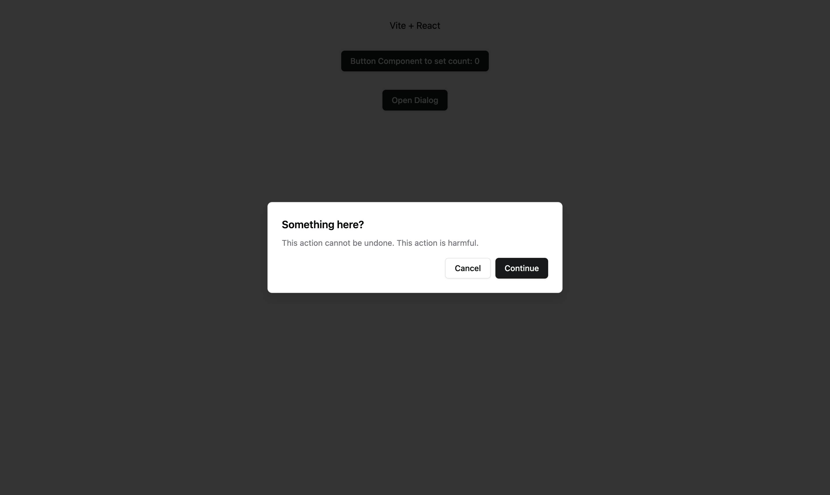
You should see something like this:

Here we're using a shadcn button to control the alert, as well as using the button to increase the count state.
Support with other frameworks:
Other than React, shadcn is also supported on multiple other frameworks including Next.js and Astro among many others. You can find more here.
Shadcn also has various themes, and color customizations to better meet your design needs. It's a really intuitive and developer friendly tool which you should start using today if you're already not!

